This post was originally published by Data-Smart City Solutions Initiative by Ash Center at Harvard Kennedy School
Through media like visual art, fiction, and even food, artists have sought to transform static data points into vibrant and immersive experiences. In some cases, governments have commissioned these artists to produce pieces that promote resident engagement with data and other works that leverage data to bring residents into the physical city. In others, artists have independently produced data-inspired works that governments would do well to publicize and examine as potentially valuable sources of information. These works have given data another mouthpiece, made digital engagement an active experience, and provided governments with critical information on their data practices.
Importantly, art that uses data as a subject has a different goal than data visualization, which seeks to display data in a more digestible format to facilitate easier analysis. Art moves past first-order insights from data to establish an emotional connection with viewers and unlock personal, embedded meanings not accessible through quantitative analysis.
MAKING DATA TALK TO PEOPLE
While data is rational and dispassionate, politicians and residents alike are moved just as much by emotion as reasoned argument. Art’s ability to make data speak to people—to appeal to their Dionysian sensibilities rather than detached reason—makes it a powerful tool for turning data into action. According to Jill Pelto, an artist and scientist who creates paintings out of climate change data, “Connecting science with art can reach a more emotional side of the viewer, helping to tell a more powerful story and even inspiring action.”
Calling for Data Art: Understanding the evocative potential of data art, Kansas City, MO developed the Art of Data, an exhibition that encouraged artists to submit works that employed city data. A joint venture between the city’s Office of Culture and Creative Services and Office of Performance Management, the initiative sought to elicit creative insights on city data from artists and bring city data to a platform more accessible to residents. “The idea was that this could be a way to put out a call for artists to look at this government data and interpret it themselves, hopefully in surprising ways,” said city communications director Chris Hernandez. “And it’s also a way to engage people who don’t necessarily pay much attention to the way the city operates—people who may not track how much of their tax dollars go toward neighborhood issues or snow shoveling.”
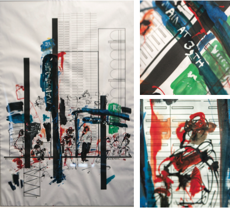
The ten resulting works of art breathed new life and meaning into city datasets on topics as varied as life expectancy, operating expenditures, and property violations. In one work, the mother and daughter team of Rebecca Tombaugh and Rachelle Hodgson created a piece that blends data visualization and abstract painting in order to emphasize the implications of city budgeting decisions. An Illustration on Community Outcomes organizes city budget by community outcomes, depicting segments of varying size and shape depending on the size of city investment in certain areas. Yet instead of using traditional bar graphs to depict these investments, Tombaugh and Hodgson invoke recognizable city patterns—for example the arcs of the Kauffman Performing Arts Center, the lines of the Christopher Bond Bridge, or the ceiling in Union Station—to create Kansas City-inspired graphical representations that stress the cultural stakes of budgeting decisions. These depictions sit on thin, brittle blueprint paper that portrays the fragility of the city’s future. Adding another layer, the piece superimposes a Kansas City bus stop scene atop this already evocative data visualization. According to the artists, “We wanted you to see and feel the reality of the lives affected by investment decisions, so just as the patterns in our blueprint are pulled from everyday life in Kansas City, the inking pulls real people from everyday life as they pause for a moment while waiting for a bus.” Much as the subjects in this piece await the bus with apprehension and anxiety, Kansas City residents await the decisions that will determine their future. And, the choice to illustrate the scene in an abstract portrait “full of drips and drabs” that contrasts with the sterility of the rest of the piece emphasizes the difficulty of understanding the concrete implications of data. While the information is seemingly straightforward in this depiction, the translation to real life is messy, as is predicting the outcomes of budgeting decisions.
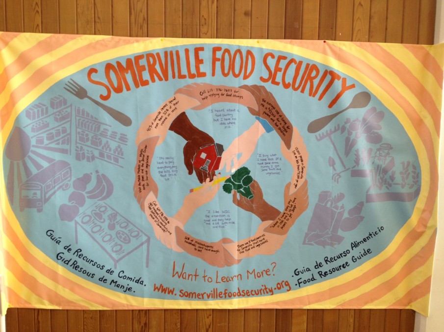
Co-Creating Data Art: Other communities have sought create data art alongside residents in order to make government data more salient for participants. The MIT Center for Civic Media’s Data Therapy Initiative has implemented a Data Mural project, in which the center works with a community group to collaboratively tell a data story in visual form. Project facilitators meet with community members to define a content area and collaboratively analyze data in that area to find a story. The group then participates in a design workshop to brainstorm visual expressions of the data and finally paints the mural. The goal of the project is to increase data literacy among the community and drive interest in telling stories with data, while simultaneously using the process of creation to tell a story itself, investing participants in the narrative produced by the data.
In 2013, the City of Somerville decided to create a data mural about food security, drawing on city data that indicated that food is not affordable and accessible for many residents. The mural displays a circle of hands linked around images of food, housing, and education, bordered by rings that depict the percentage of Somerville residents living in poverty over time. Within this circle are quotes from residents about their experiences with food insecurity, like one that reads “It’s really hard to pay everything, pay the bills, buy food. It’s a lot.” Taken together, these components emphasize the interconnectedness of housing, education, and food inequality and the need for community collaboration to mitigate this struggle. The mural itself serves as an emotional call to action for Somerville residents, and the process engaged participants in the story of food insecurity, creating a personal connection to the issue. Belo Horizonte, Brazil, Cambridge, MA, and the Jamaica Plains community in Boston have all pursued similar projects to immerse residents in data around a particular issue area.
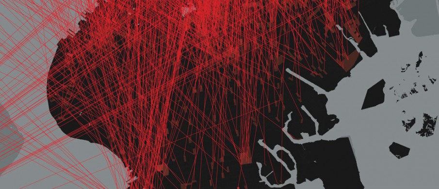
A Critical View of Criminal Justice: In other cases, artists have independently taken on the project of using city data to create compelling works. Million Dollar Blocks, a series of digital images created by Columbia University’s Spatial Information Design Lab for the Museum of Modern Art’s (MOMA) show Scenes for a New Heritage: Contemporary Art from the Collection, introduces artful data visualization and text that converse in an artistic dialectic in order to evoke discontent with the American criminal-justice system. The video piece walks viewers through a series of data displays showing that a disproportionate number of the more than two million incarcerated individuals in the U.S. come from a few neighborhoods in the largest cities. Far from detached presentation of this data, the piece makes clear artistic decisions in order to make its point. Violent red lines suggesting sniper scopes sit atop bleak black maps to show the migration of residents from certain neighborhoods to jails. Vivid narrative, also displayed in red and black, contextualizes and deepens the appeal of this information. Together, these harsh elements underscore the brutality of the American criminal justice system.
What Housing Data Really Looks Like: A piece at Whitney Museum of Art about the fraudulent activities of one of New York City’s largest slumlords sought to create an even more direct emotional connection to data via photographs of the problems that city data represents. Hans Haacke’s 1971 Shapolsky et al Manhattan Real Estate Holdings, A Real Time Social System covers four walls with black and white images of derelict Manhattan tenements, maps of Harlem and the Lower East Side, and charts documenting the ownership structures of these buildings. Black lines outlining the course of real estate transactions dart manically across pages, emphasizing the disorder engendered by the activities of tenement owners, designed to deceive unwitting tenants and law enforcement alike. The exhibition itself confuses the viewer with a glut of information and simulates a tenement itself, crowding the walls of one room with closely spaced works that amplify the cramped sensation of a room already flooded with visitors. The Whitney calls the piece an “institutional critique,” which, by both illustrating and leading viewers through the process by which tenement owners defrauded residents into appalling living conditions, emphasizes the tragic effects slumlords had on low-income residents.

(Not So) Delicious Data: Another data art project has sought to appeal to residents in a much different way, targeting their stomachs rather than their hearts. For a project called Data Cuisine, chefs create colorful dishes whose component ingredients represent different local data. During an event in Boston, chefs tackled data related to local issues like food sourcing, wealth inequality, and water pollution. The goal was to appeal to senses not normally activated when digesting data (pun intended). According to Data Cuisine co-founder Moritz Stefaner, “taste is a much more emotional and temporally complex experience than just looking at a dot on a screen. So, the mechanisms to encode information might be more fuzzy, but potentially much deeper.” Perhaps most compelling was the series of vodka jello shots titled A Million New Friends that depicted fecal-coliform levels at various times of year in Boston Harbor by adding different amounts of lemon zest to the bottom of each drink. This stomach-churning creation certainly produces a visceral reaction to pollution in the harbor, evoking disgust with the Harbor’s conditions.

A MORE HUMAN TYPE OF DATA
The digital city—made up of sensors, computer chips, and troves of data—is often abstract, dispassionate, and impersonal. However, it does not have to be this way: other artists have used data-inspired art to blend the digital city with the physical city that informs it, creating a playful human interaction that reorients residents’ relationship with city data.
Personalizing City Data: British company Pan Studio creates experiences at the intersection of technology, theater, games, and art. In Bristol, England, the studio sought to activate city data to create playful experiences for residents. In a project called Hello Lamp Post, Pan re-purposed the identifier codes used on city infrastructure to relay text messages to objects around Bristol. During the project, a resident could have an SMS conversation with a lamppost, post box, bus stop, or another object, which would then remember the conversation and bring it up with the next visitor. For example, a bus stop might tell someone that the prior visitor thought the lamppost down the road looks like a stick figure, and encourage him or her to check it out. The idea was to use city data to provide residents with an experience of the physical city, tapping into residents’ emotional memory around places and introducing them to new places. Since the initial release in Bristol, Pan has replicated the experience at a one-day cultural event in Tokyo as well as in Austin, TX, where the city’s Cultural Arts Division of the Economic Development Department commissioned the project.
Hello Lamp Post adds a human element to data collection and analysis. Instead of collecting resident data invisibly and automatically, Hello Lamp Post collects information via playful conversations between residents and city objects, inviting residents to actively participate in data collection and engage with city infrastructure. And, the information produced as a result provides a unique human illustration of a city: “The portrait that Hello Lamp Post paints of a city is often charming, sometimes mundane, occasionally profound, but rarely definite,” explained Pan Studio founder Ben Barker. “Perhaps one of its most important traits is its lack of tangibility, an idea of a place that is somehow all the more human.” Unlike quantitative analyses—which create an image that is uniform, precise, and detached from personal perspective—projects like Hello Lamp Post offer a picture that is ambiguous and deeply personal. Hello Lamp Post has offered cities access to unique meanings unavailable in traditional data collection efforts, all while immersing residents in the physical city.
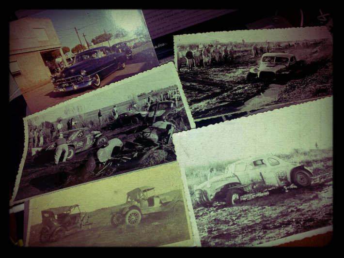
Collecting Nostalgia: A project in Argentina has sought to transform the process of collecting, sharing, and accessing information on city buildings into a communal and interactive endeavor. CrowdMemo allows residents to contribute to a crowdsourced history of meaningful spaces. Local students conduct research along with their families and peers to explore the history behind their community’s spaces, collect anecdotes from longtime residents, and create micro-documentaries about each location. Students then upload these videos to the cloud, and QR codes linking to each video are stamped on the façade of each place, inviting residents to investigate the city’s spaces. In this process, collecting information becomes a collaboration among residents, and accessing this information is possible only through engagement with the physical city.
Like Hello Lamp Post, this project humanizes resident interactions with city data, an accomplishment that municipal governments should aspire to. Rather than requiring users to scroll through lifeless spreadsheets, CrowdMemo encourages residents to experience data personally and dynamically through the physical city and allows cities to collect unique cultural information.
COMMENTARY ON USES OF DATA
“FBI, here I am!”: After he was detained by the FBI for six months upon a return trip from the Netherlands, Bangladeshi-born American artist Hasan Elahi sought to use data to create art of a non-traditional kind: he began creating a map of his every move. At first, Elahi started calling the FBI every time he was traveling to give them his itinerary and general whereabouts, then began emailing them with detailed travel plans. Soon this effort to document his comings and goings grew into a website called Tracking Transcience, where Elahi now uses his phone’s GPS to sync his movements to a live map and posts minute-by-minute photos of his life, as many as one hundred a day. The photos depict many of the tedious moments of Elahi’s life, from the trains he’s commuting on, to bathrooms he’s visited, to airplane meals he’s eaten. Over the years, he has amassed hundreds of thousands of data-points and pictures, all in an effort to inundate the federal government with a prohibitive amount of information. “You have data?” he asked, “Well I’ve got data too. By putting everything out there, the government’s data no longer means very much…FBI, here I am!”
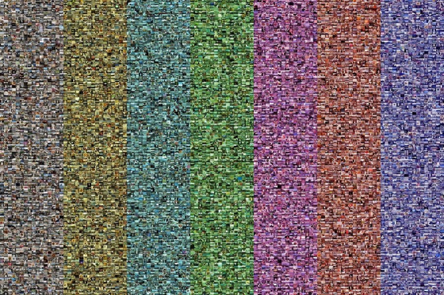
However, more than an effort to keep the government from surveilling his every move, Elahi’s website offers a critical commentary on government’s efforts to collect troves of potentially invasive data. The website expresses the absurdity of government’s inclination towards obsessively collecting data and provides a personal example of the critical consequences of overstepping reasonable privacy expectations. It is an apt reminder that any government data program must place an emphasis on maintaining resident privacy and should engage residents to understand what data they are willing to give up. Moreover, this piece offers governments a visceral insight into the need for curation of data. By overwhelming the viewer with sheer volume of data, Elahi shows that troves upon troves of uncurated and unstructured information are completely useless. It is only through careful selection and display of data that governments can create a valuable product. Art, which has struggled with accessibility for much longer than data science, has much to teach governments on how to make data reach real people.
Governments should view these critical commentaries not as nettlesome affronts, but rather as opportunities to learn about the personal effect their data programs have on residents. When developing privacy policies or data visualization tools, cities should therefore look to data art as a small but important part of the literature outlining best practices.
While governments are right to celebrate and leverage the wealth of detailed knowledge that data can provide, they must remain conscious of the media that people are most likely to connect with. Instruments like visual, narrative, and experiential art are powerful tools for making insights from data salient to residents, as well as transforming resident interactions with data into fun and exciting experiences. Moreover, existing data art can show governments the real, human effects of their data and the power of curation. While not necessarily an everyday practice, exploring data art can help governments increase the reach and effectiveness of their data practices.