Flipboard – Started from the Top and Now We’re Here (in a Hole)

In this post, we explore how Flipboard ended up as a loser in the digital content aggregators space.
When Apple launched its first tablet in 2010, the founders of Flipboard immediately saw an opportunity to create a central hub for magazines, digitally. Flipboard’s beautiful design, reminiscent of high-end magazines, and intuitive navigation led to rapid user growth: Flipboard was in Apple App Store’s top 100 apps for 18+ months straight. Apple lauded Flipboard as the best iPad app of 2010 [1]. Top names in tech including KPCB, Dustin Moskovitz, Ashton Kutcher, Jack Dorsey, etc. funneled $210M into the company, at an $800M valuation [2]. Flipboard had huge momentum and appeared to have a bright future ahead.
Fast forward to today: ways to consume digital content are almost as abundant as amount of content available, and Flipboard is just another player in a sea of offerings. For example, Apple News for iOS and Google News, are just two of countless competitors also aggregating high-quality content from numerous publishers…
Value Creation
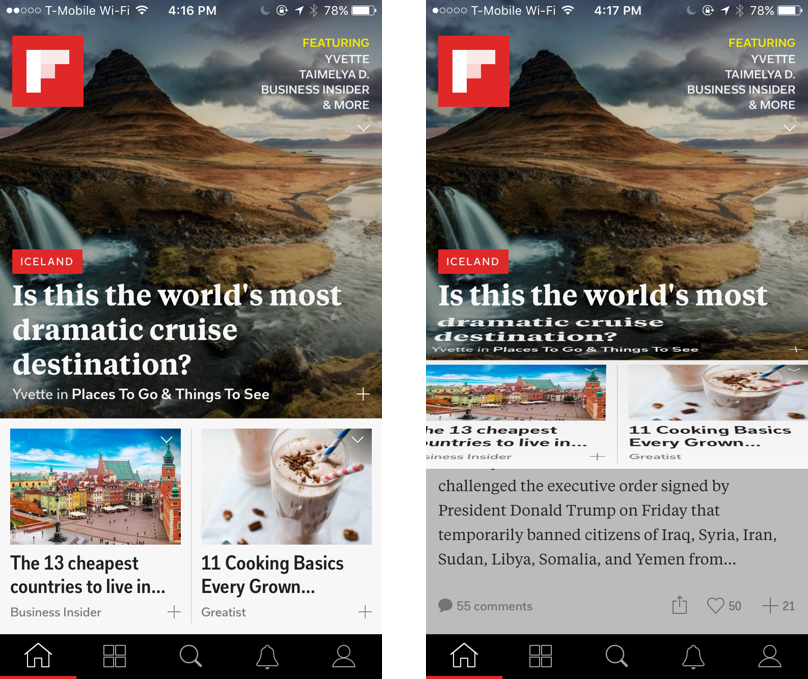
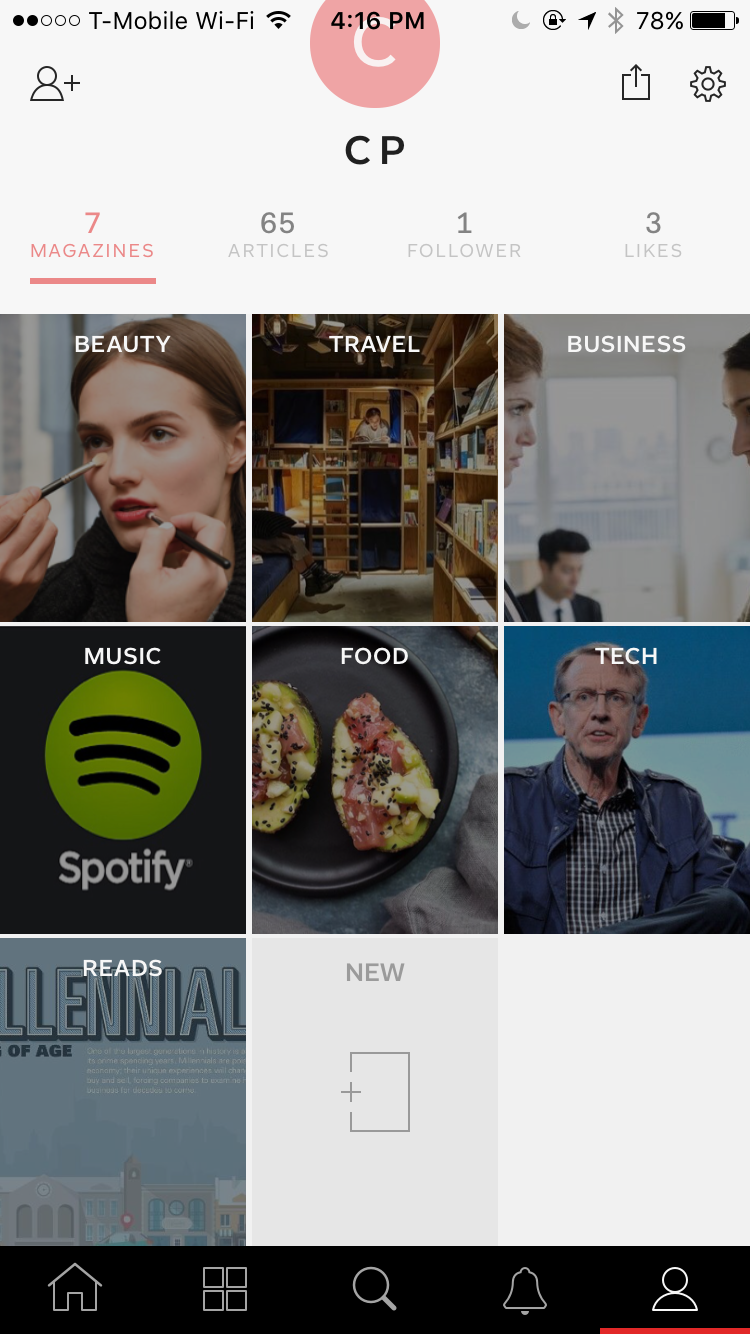
End users: value created for end users was clear from the very beginning — a central place to digest all your favorite content, regardless of device (desktop/mobile/tablet app). This app replaced your old RSS feed.When a user signs up, the user tells Flipboard about his/her interests by selecting “favorite categories” such as travel, food, sports, politics, etc. Flipboard then aggregates articles based on those stated preferences and presents content in a visually appealing way. The user can flip through different news articles in the app, as well as create folders to save articles, a feature that increases user stickiness as the user builds a repository inside Flipboard.
 [Left] Flipboard’s clean, simple design is aesthetically pleasing
[Right] Instead of scrolling, users flip up for more content. This action unique to Flipboard provides users with a sense of achievement each time they complete a “page”
 I’ve created folders to organize my many favorite articles inside Flipboard
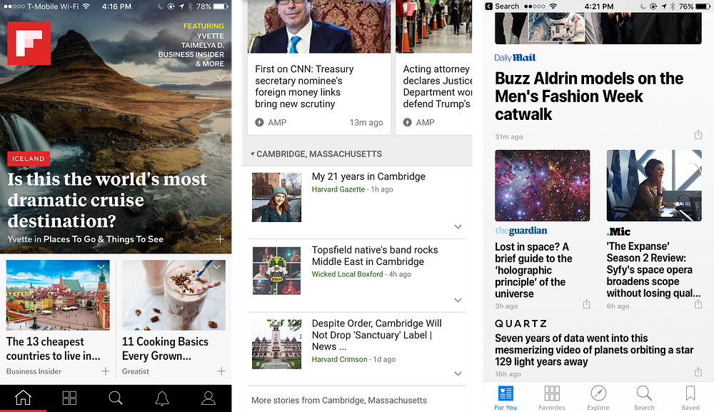
IMO, Flipboard’s app still has the most visually appealing design vs. competitors. The app does a superb job of balancing visuals with headlines and content preview. User interface is simple, clean, and intuitive. Users are never overwhelmed by too much text, tabs, or information, as seen in the first screenshot below. In comparison, Google News (middle screenshot) and Apple News (right screenshot) look cluttered:

[Middle] Google News’ and
[Right] Apple News’ approaches
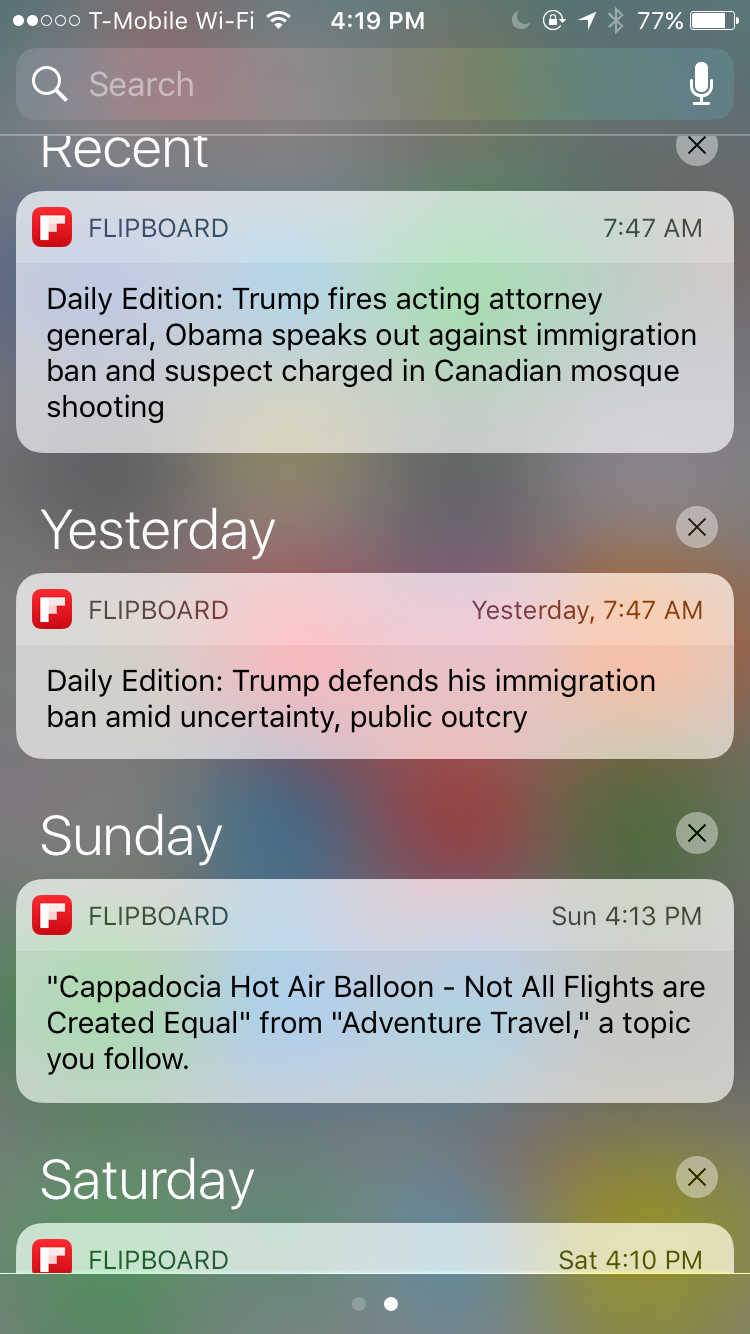
The product does a good job of re-engaging users via relevant and well-timed push notifications (mornings on weekdays, before users head to work; afternoons on weekends, post brunch). Users are given the option to customize types of push notifications they receive so that app does not burn this important channel:

From my observation, Flipboard appears to have the most publishing/content creator partnerships, hence the broadest content base. There are articles on Flipboard that other apps don’t have, but not vice versa. For example, Google News only covers more traditional news topics: World, US, Business, Technology, Entertainment, Sports, Science, and Health, so as a user, I’d have to supplement Google News with other sources for additional reading.
Publishers: Flipboard provides publishers with exposure to more readers. Initially, publishers feared disintermediation, but quickly realized that the transition from analog to digital was inevitable. Many publishers were slow to build their own digital presence, so Flipboard was their initial way to reach and continually expose their content to digital users. Flipboard became another user acquisition channel. Per WSJ, “the startup struck partnerships with New York Times Co., Condé Nast and others publications, and worked with them to sell visually rich, interactive ads alongside content in the app [1].
Value Capture
The profit model is where Flipboard fails big time. Like many B2C apps, Flipboard struggles with value capture. During Flipboard’s early days, the company charged advertisers such as NYT and Condé Nast the equivalent of around $50 for every thousand ad impressions [1] for user acquisition. However, as more players entered Flipboard’s space (NYT, Condé Nast, and many other publishers now have standalone apps that also sell advertising inventory), CPMs became increasingly compressed. The rate Flipboard charges most advertisers has dropped by more than half, to less than $20 per thousand impressions [1]. From January to October 2016 Flipboard only brought in $31M of their target $43M for 2016 [3]…nowhere near a revenue number that would justify its funding and valuation.
Decreasing ad rates may not be an issue if an app’s user base is growing rapidly. Unfortunately, Flipboard’s user growth rate is also on the decline — it only added 10M users in 2016, from 80M to 90M [3]. Pairing compressed advertising fees with slow user growth, you have a company that needs to figure out additional ways to monetize.
Perhaps the size of digital content market is smaller than expected, and this is a bad space to be in, in general. Fortunately for Google and Apple, they have other business units to subsidize their aggregator products. Google and Apple may very well be losing money on their News products but collecting the additional data from aggregators and marrying it to their existing information to paint even more complete pictures of users’ lives. Flipboard has nowhere near such targeting capabilities so it has less to offer to advertisers.
In the end, if a company can’t make enough money (especially one that’s raised money at $800M valuation!), it’s not a sustainable business, which is why Flipboard is a digital loser this point in time.
Despite its financial woes, Flipboard is one of my favorite apps of all time for its content and design superiority. Check it out!
- iOS: https://itunes.apple.com/us/app/flipboard-your-social-news/id358801284?mt=8
- Android: https://play.google.com/store/apps/details?id=flipboard.app&hl=en
[1] https://www.wsj.com/articles/flipboard-once-hot-newsreader-app-flounders-amid-competition-1446075404
[2] https://www.crunchbase.com/organization/flipboard#/entity
[3] https://techcrunch.com/2016/10/13/flipboard-looks-to-boost-native-ad-sales-with-swipe-friendly-storyboards/


As someone who used to use Flipboard and stopped (for no good reason), I really like your take on the company. Do you think that this is a position in the market that has been subsidized by so many competitors (you mention Google and Apple) that it is / always will be impossible to compete? Is there a valid play charging consumers and creating a niche business? Seems a shame that an app with such a great UX and value creation should fail as a business…
In general I don’t think Flipboard’s been too sophisticated with monetization. It could and should test different models. I think they’ve been scared to charge users directly because US consumers are so used to the ads-based model. However we now see more and more apps monetizing via subscriptions. As consumers become more comfortable with subscriptions, Flipboard could try going that route. Flipboard could even asking for donations (similar to what Wikipedia does).
I am also a huge fan of the app, so your post caught my eye! I am more bullish on them because if nothing else they have created a lot of value and have the potential to explore different business models to capture it. I agree with your assessment of the continuing decrease of ad revenue they might get. However, they could use affiliate programs to capture some revenue as a mobile influencer aggregator with an active following. I think they can experiment with their business models.
Definitely! I feel like the team has focused too much on creating value via designing a great product and not enough on actually capturing value – perhaps based on fear of losing users.